We have seen many interior renovations that updated old homes and turned them into masterpieces that we never expected could actually happen. You have even seen before and after photos of those spaces which helped you to appreciate the change even more. With the many home designs now a day, there are many sources of inspirations and ideas that we can get that can be applied to a home redesign or renovation. Today, we are going to feature another before and after post featuring a micro loft.
The images of this New York loft apartment is very inspiring since it shows us that whatever space you have, there is still a huge chance to change it and improve it. At first, you will see the images before the renovation. Although it looks okay, it doesn’t suit the taste and design preference of the owner and they wanted a better modern change to it. The loft apartment is designed by Scott Specht and Louise Harpman to renovate the 425 square foot space on Manhattan’s Upper West Side. You will see how the added the bedroom and the kitchen. Let us take a look at the images of the loft below.
Location: New York
Designer: Scott Specht and Louise Harpman
Style: Modern
Type of Space: Loft Apartment
Unique feature: A small Manhattan loft apartment undergoes an extensive renovation resulting into a beautiful modern space.
Similar House: Modern Industrial Loft Apartment in Ukraine
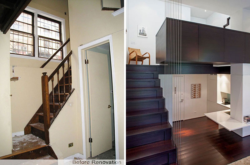
You can see here a clear comparison of the loft apartment. The image before the renovation shows that the stairs look old and outdated and it has a room beside it. After the renovation, the space looks different and it looks really better than the previous one.
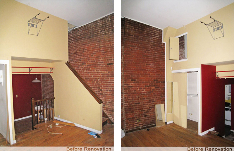
Before you see the finished loft, let us take a look at the space prior to the renovation. The layout of the loft was really awkward and there were no good places to put a bed or sofa. And everything was very dated.
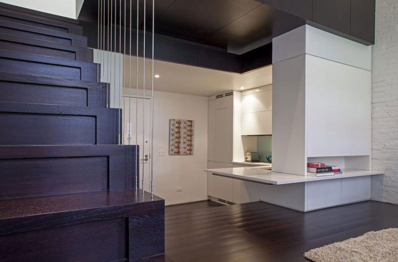
The lowest level of the apartment is an entry and kitchen space, with a few steps up to the main living area. As we can see it, the kitchen is sunken with all white colors in it, allowing the wooden staircase and flooring with dark finish to be emphasized.
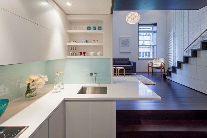
Seen here is the kitchen that features fully concealed appliances and flip-up storage units for easy access. You can see that the lower cabinets under the kitchen countertops have a light gray color.
Read Also: Airy Industrial London Loft Apartment in England
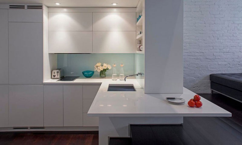
The kitchen countertop wraps around into the main living area of the apartment. This way, it provides extra shelf space under the built-in entertainment unit. You can also see here that there are more storage spaces in the area.
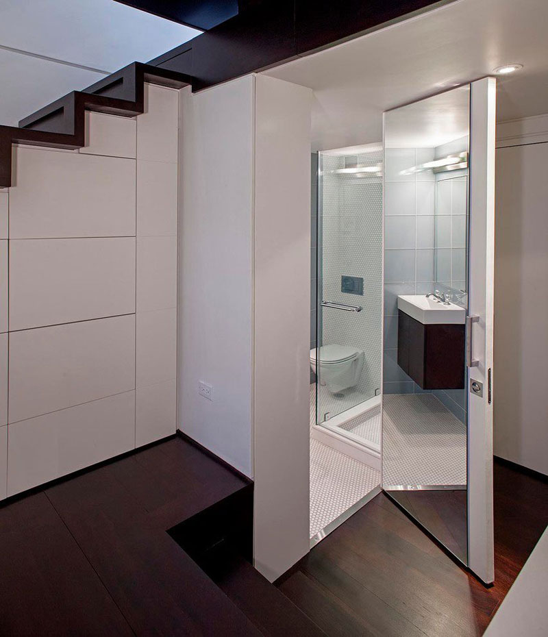
All the spaces flow into each other which dissolves the idea of having distinct rooms. The only door within the space is the one in the bathroom because of course we need a door for this area. It is built below the main staircase.
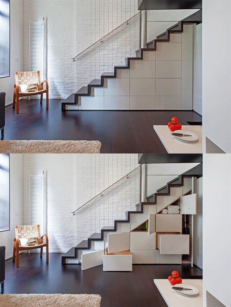
Since the apartment is small, every inch of space is used and maximized, like the stairs that do double-duty as storage.
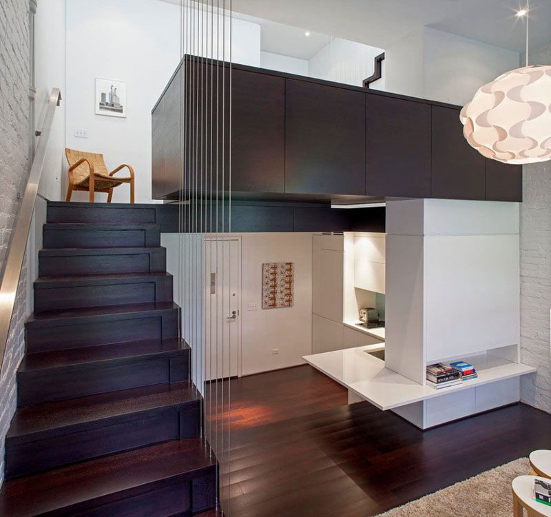
Seen here is the sunken kitchen as well as the cantilevered bed pavilion that projects out into the main space. It is supported on steel beams and it looks really nice with the wooden materials used in it.
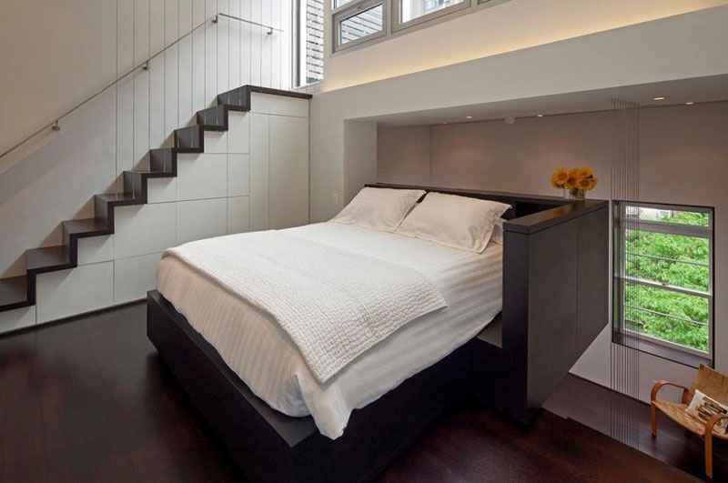
The bedroom has a minimal design with just enough space for a bed. Also, you cannot see excessive decors in here. It is just simple which makes it beautiful.
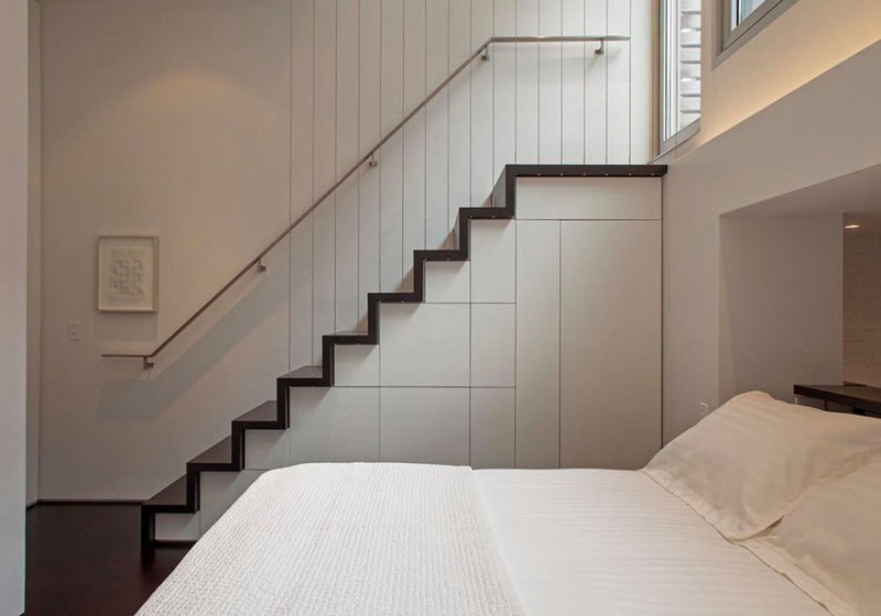
Here you can see that there is more storage built-in under these stairs as well, just like the one in the living area. It also use white in most of its areas.
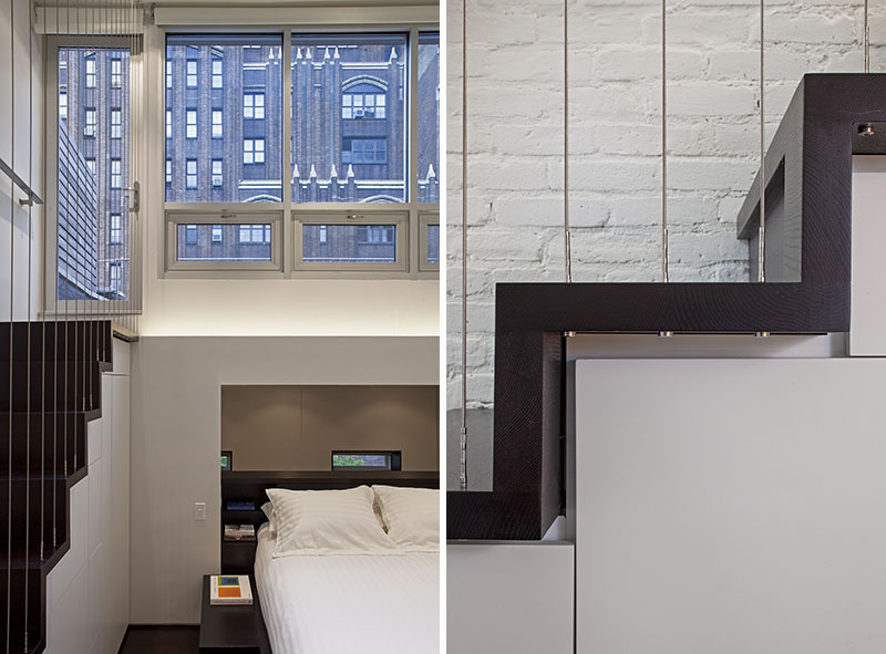
We can see here the stairs in the bedroom that lead up to a roof garden. You can also see the details of the staircase and the wooden treads in it. You are also given a glimpse of the windows in the upper level.
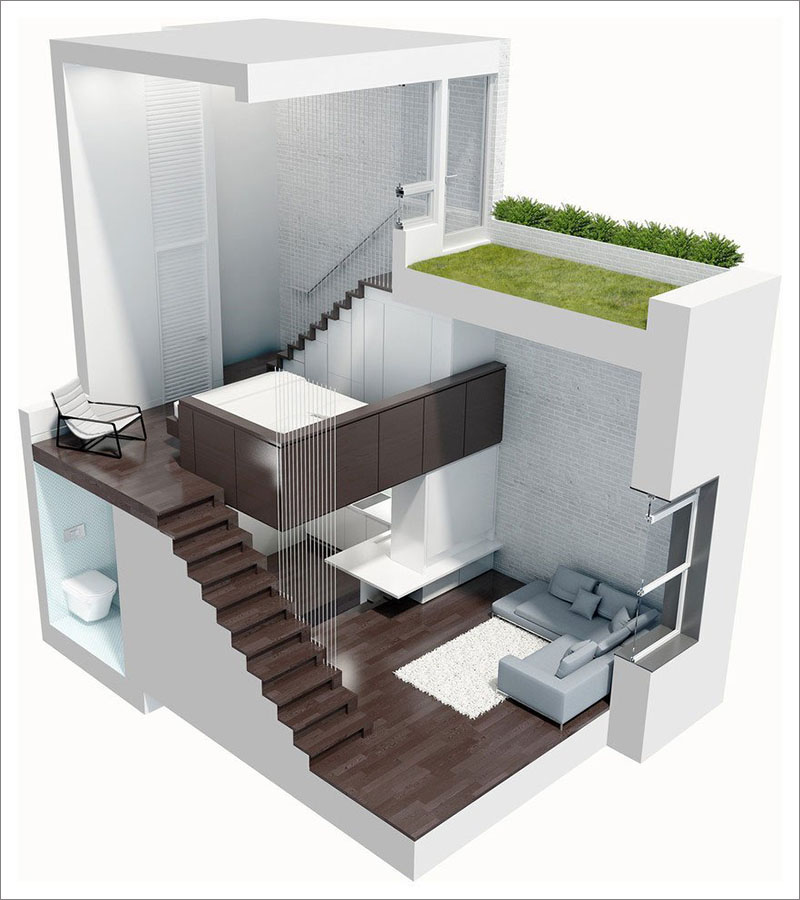
This image shows the new plan of the apartment. The designers created four separate living platforms to provide room for all the essentials and still allow the apartment to feel open and light-filled.
I know that you find this renovation really nice. There is indeed a big different between the previous space and the recent one. I also like the colors it used here with merely black and white. But what I like most is how it added the bedroom and how one could leap to a roof garden from the area. This loft is designed by Scott Specht and Louise Harpmand. And we can see that their collaboration is indeed successful because of how things turned out. For sure, this will give you ideas on what to do especially if you want to have a loft space like this one. How about you, what can you say?