When designing a small area, it is important that every aspect of it will avoid clutter and will make it look more visually spacious. This can be done by using glass and mirror elements in the space. This way, more natural light can enter the space which will make the area brighter. Some interiors opt to use light colors or white but others still bring in dark colors and textures. Surprisingly, the home still looks nice that way. And this is what we will see in the interior of an apartment that we will feature today.
This project called the Tiny Stylish home is an example of a commercial but at the same time conceptual residential real estate project that is designed for leasing. The customer had 4 typical apartments, which should have been worked out in similar design. The goal of the designers is to get the effect of a 5-star hotel rooms, using precious materials and multipurpose design that would be liked by most of potential tenants. But they are restricted with budget, which included decor, home textiles and house-hold appliances. If you live in a small apartment, having a bedroom inside its own separate walled-in room will make an already small apartment seem even smaller. However, you’ll probably still want to define the bedroom area as its own distinct space. One way of doing this is to use glass doors. And that is exactly what Nataly Bolshakova Design Studio did with the bedroom in this apartment. They used dark tinted sliding glass doors to separate the bedroom from the living area, allowing the bedroom to have its own dedicated space, and at the same time not having a full solid wall, so light and views can still pass through. It keeps the space somewhat open, but also defined at the same time.
Location: Melbourne, Australia
Designer: Nataly Bolshakova Design Studio
Style: Contemporary
Number of Levels: Apartment
Unique feature: Despite being small, the apartment looks beautiful and sophisticated as it used contrasting colors of dark gray and white. It also has wooden elements in it as well as a bedroom that has a glass sliding door in it.
Similar House: A Cute Girls Bedroom with a Lofted Play Space
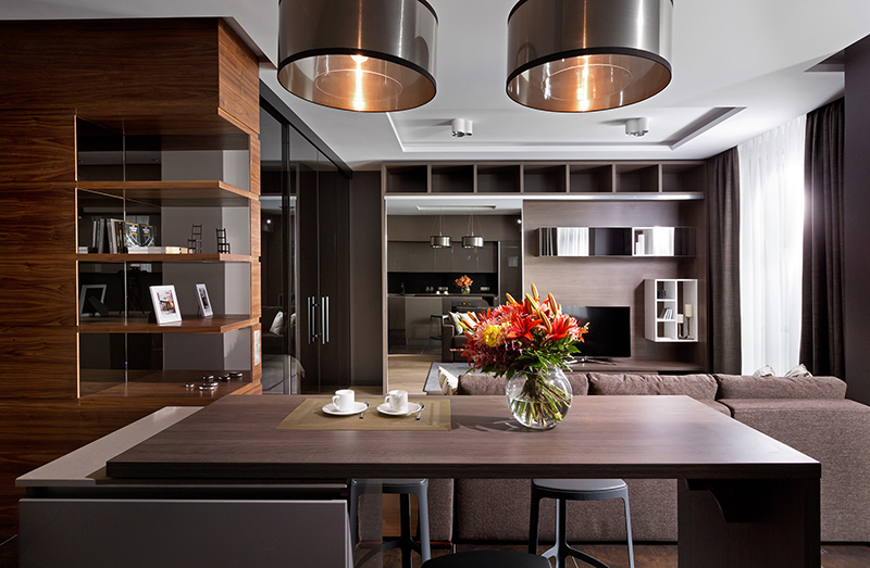
The designers worked on everything for this project including choosing the dishes, textiles and home appliances. It turned out to be a completely new format of work for the designers. They used creative and eclectic approach to the choice of materials for decoration which turned out really nice.
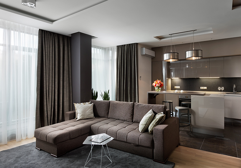
The design of the space is modern, universal and comfortable using wood, mirrors, and shiny surfaces. Abandoning clear white tones, they made emphasis on deep and gentle shades, mostly for practical reasons.
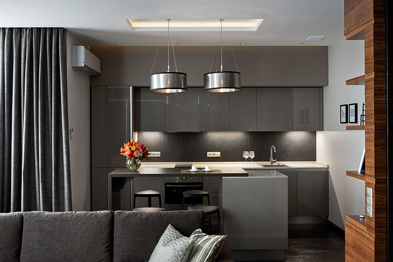
There are Italian kitchen, Spanish light pattern and Ukrainian parquet in this interior. It was important to make the best choice within the budget. Complete unit of four similar facilities gave the possibility to get the best price, so the client was satisfied.
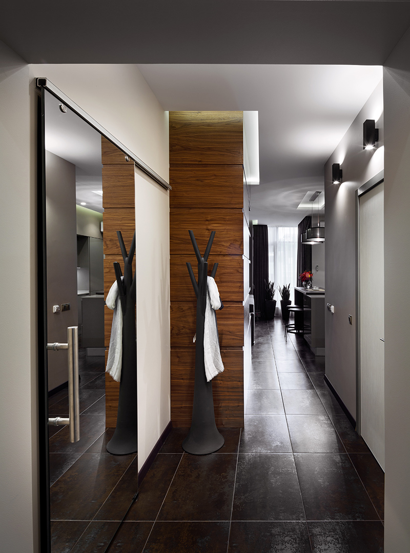
Seen here is the hallway which has a mirrored door, dark flooring and wooden features on the wall. Even that hall tree has a unique modern design that is very functional.
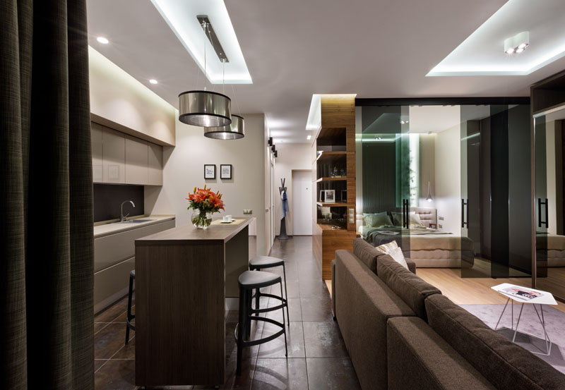
The stylish kitchen in this interior is from the Arrital Italian factory. The format is represented by the island with a sliding top. This decision allows to comfortably accommodate four people at the table, but in the assembled state the island is designed only for two.
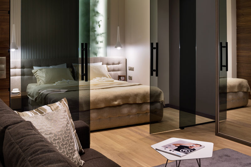
The glamour style is presented in the project. This time it is a corrugated wall made of gypsum behind the bed. Plants were integrated in the house using artificial branches. It also used frosted glass and muted lights which are to bring the liveliness to the space. Not being fans of windows imitation we are sure this island of greenery perfectly refreshes the hidden in an alcove bedroom that lacks natural light.
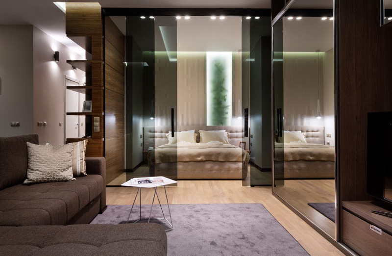
The bedroom can be seen from the living area. The way I see it, they might have a thick drapes inside for added privacy because the black glass sliding door still makes it transparent to the interior of the bedroom. It sure is a good sight from the bedroom because of its beautiful design but once you are sleeping inside, it wouldn’t be nice if guests are staring at you like you are a show of some sort.
Read Also: A Summer House Boasts a Parent’s Bedroom with Play Area
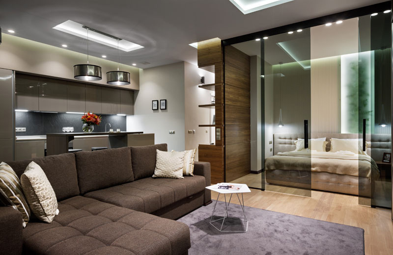
The interior has many dark colored items in it but despite that, the space doesn’t look dull or creepy or boxed because it added ample lighting and also brought in other light colored items to balance the look. Yes, that is the right term, this interior has good balance in terms of color, texture and other elements of design.
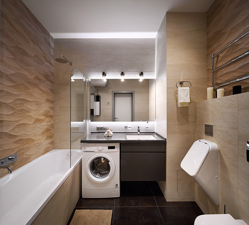
Seen here is the bathroom with textured wall. Aside from being a bathroom, it also doubles as the laundry area which is a good way to maximize the use of the space. The lights here look nice and bring beauty to the area which has a contrast of color usage in it. Notice also its sleek looking urinal and toilet.
This apartment has an area of 51 square meters and despite that size, it looks pretty awesome. Love all the colors in it as well as the items added in it from the decor to the furniture. And of course, it is a great idea to use glass sliding doors for the bedroom instead of a concrete wall since this will make the area look a lot smaller. This apartment is designed by Nataly Bolshakova Design Studio and I love what they did to it from the colors to the materials and the layout. Who would think that a small apartment can actually be this beautiful?