It isn’t new for us to see transformations of home interiors because we have seen so much of spaces like that. But even if we have seen a lot of these, it still never fails to impress us when we see before and after images of homes showing us how much the space has changed. And yes, as always, we end up appreciating the changes of the homes even more. And it also makes us realize that no matter what is the condition of the home, it will still turn our really nice as long as you work with the right people who can help you with the right design.
So, when the owners first encountered an apartment in San Francisco, they were attracted to its warehouse vibe which is reminiscent of the 1924 building’s previous stint as a printing business. The owners saw the potential in the space and decided to renovate it with the help of Steven Stept. The home turned out really nice and one feature that will make us determine that it is indeed the same space are the large columns inside it which at first looked like an eye sore but it turned out to be one nice element in the house after the redesign. Let us take a look at the loft apartment transformation below.
Location: San Francisco
Designer: Steven Stept
Style: Modern
Type of Space: Loft Apartment
Unique feature: A loft apartment that once looked dull and boring was transformed into a stunning contemporary space.
Similar House: Before and After: A Blank Apartment to a Modern Bachelor’s Pad
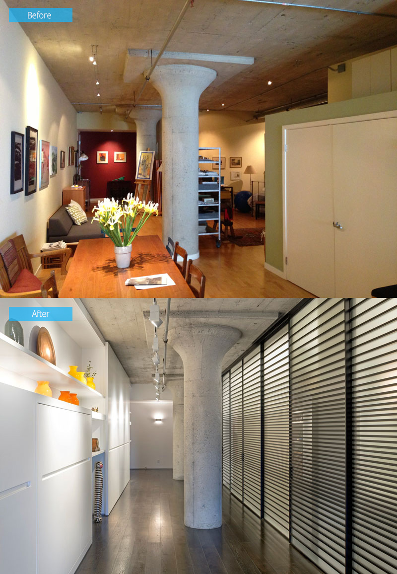
Before they started the renovation, the space looked ordinary and dark. But since the clients situated themselves at the heart of the design discussion by managing the project with the help of a superintendent in lieu of hiring a general contractor, the design turned it even more beautiful as you can see in the before and after images.
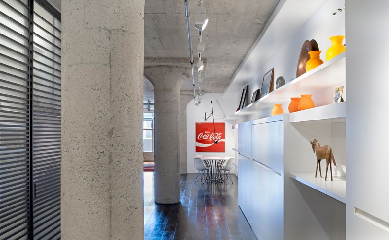
The remodel pulled one of the long, narrow apartment’s walls back from its previously angled position. Doing this allowed natural light from the largest window to fill the entire length of the apartment.
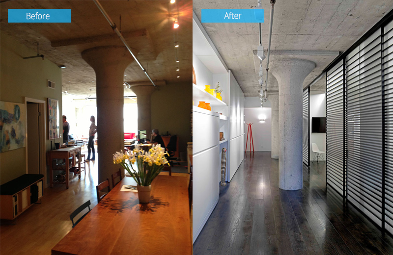
Custom shelving elongates the hallway and accentuates the length of the loft. With the images seen here, you can compare the differences added to the home which is indeed very notable.
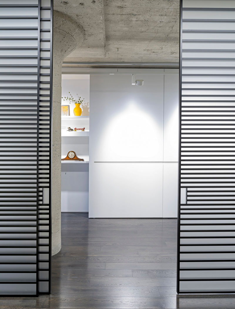
The hallway has plenty of storage to avoid clutter in the loft and what is nice about the storage areas is that they are white in color like the walls too.
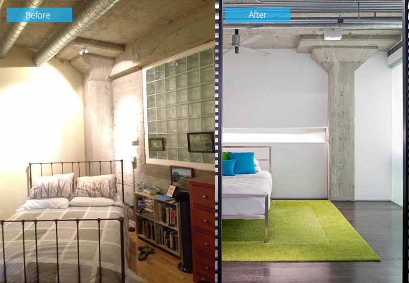
Seen here is the before and after photos of the bedroom. It included horizontal slatted aluminum and glass sliding doors from the Italian designer Adielle. The sliding door, which we also saw in the previous image, hides the master suite and a powder room. There sure is a huge difference between the two bedrooms.
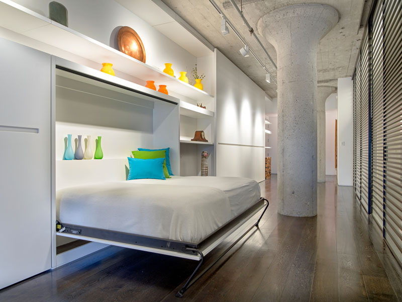
There is also a murphy bed that was added to the wall so that guests can stay overnight. And I like how neat this wall bed looks like.
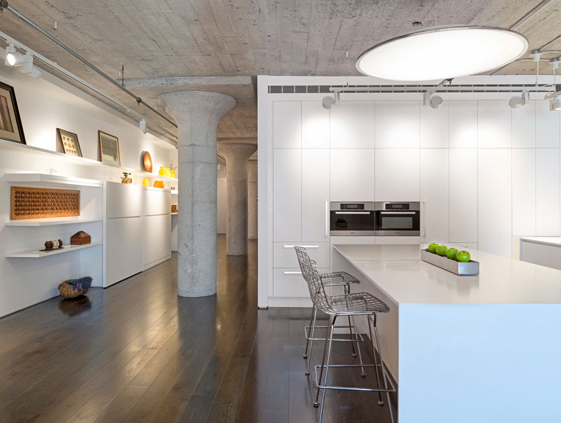
At the end of the hallway is the kitchen and living area. The combination of white and concrete in the interior looks beautiful and totally modern. I also like the decors added in the area.
Read Also: Modern Industrial Loft Apartment in Ukraine
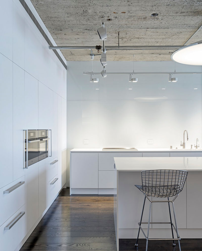
The kitchen may look simple but it sure is neat in white colors and it has everything one needs to prepare and cook food. You can also see here a steel chair for the island.
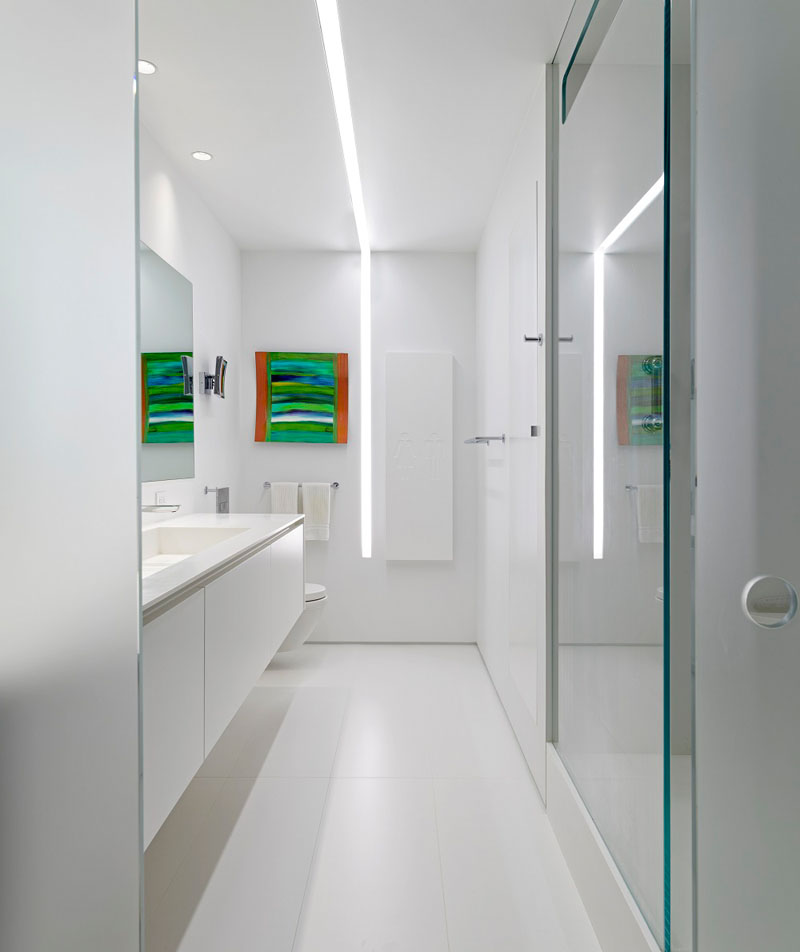
The bathroom is lit by a line of light that runs the length of the bathroom and down onto the wall. Isn’t this beautiful? It is also a good idea to add a colorful wall decor in the bathroom breaking the white colors in it.
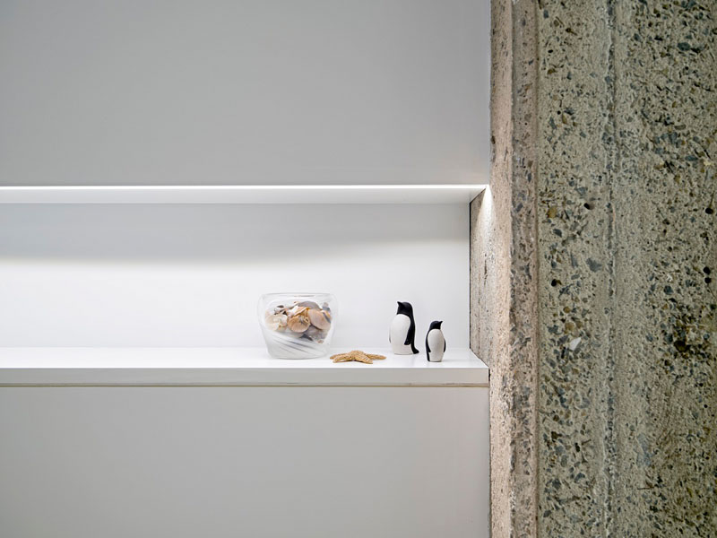
There are many storage spaces in the house but aside from that, notice this rough concrete wall that brings texture into it. The concrete portion is a nice contrast to the neat white areas of the house.
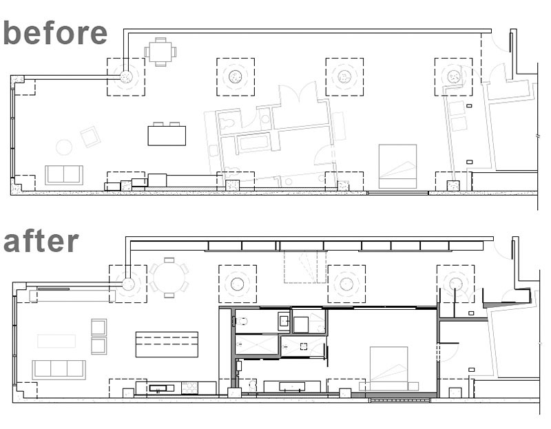
In the before floor plan, you can see how awkward the layout was and was improved with the new design created by Steven Stept, who designed the project with his previous partner Irit Axelrod, and saw it through construction at Feldman Architecture.
Steven Stept apparently did a great job in this apartment. The design of the space looked really beautiful and it sure has brought the home’s look to a totally higher level. To be honest, it is a bit hard to redesign the space because of the columns which obviously cannot be removed since it is there for structural purposes. I also like it that they used white paint to bring more brightness to the area. How about you, what can you say about this loft apartment transformation? Did you like how it turned out?