Utterly Stunning Australian Holden Street Residence Interior Renovation
Some homes don’t necessarily start from scratch. Others merely update the look of an existing home while still others add an extension to their homes. Whatever they do, what is important is how the final result of the job looks like and how it caters to the needs of the homeowners. It is always important that the house suits to the lifestyle and needs of the owners because if not, no matter how stunning the home is, it will still be futile.
A family from Fitzroy North, Australia wanted to update the look of their back house because it was a dodgy 1980 home nightmare that is damp, cold and possum infested. So, the half back part of the house was removed and replaced with a new space with small open living/dining area that has a large steel door that leads to a sunny backyard. In the interior, it features an internal pod that houses the bathroom, bathroom, powder room and pantry. Another nice feature in the house is the large window in the living room that seems to frame the beauty of the garden. This home is called the Holden Street Residence and you will be able to see its interior below.
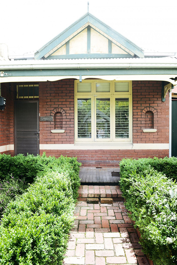 This is how the front of the house looks like. It would be surprising to see such stunning beauty inside it.
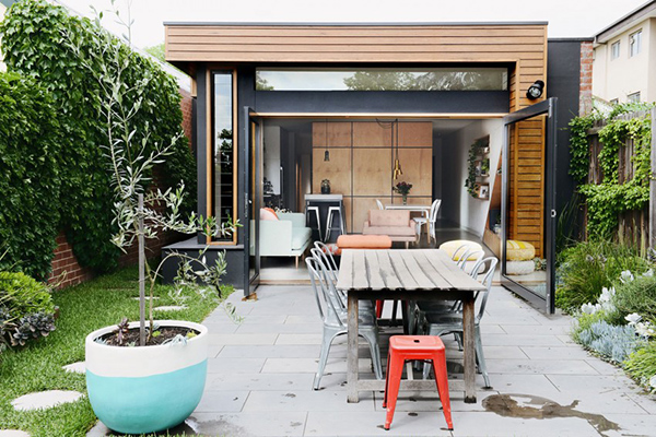 In the garden, there is a dining space where the family can spend time together while enjoying nature.
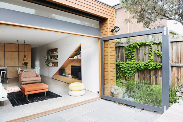 A huge steel door opens the living and dining area into the garden.
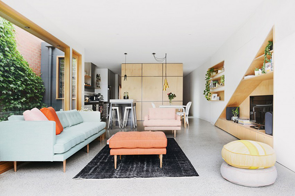 Seen here is the interior of the house with impressive built-in shelving design. The open layout of the interior holds together the living, dining and kitchen areas.
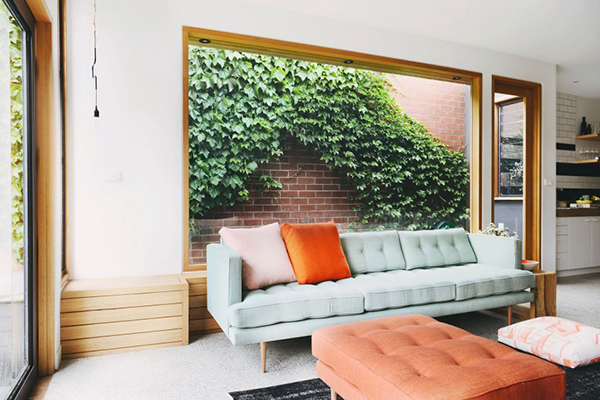 A large glass window is framed with wood that seemingly create a photo frame effect.
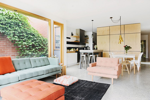 Lovely and modern furniture were used for the interior which matches perfectly with the entire look of the space.
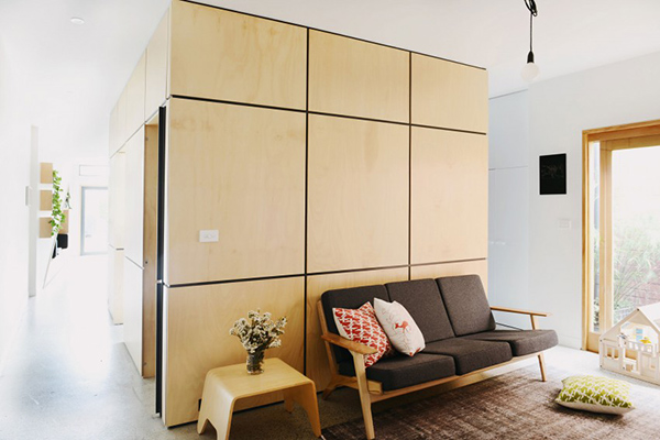 An internal pod sits in the middle of the house where you can see the bathroom.
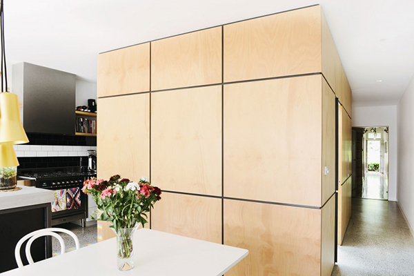 The central ply clad pod separates the playroom from the main living/dining area.
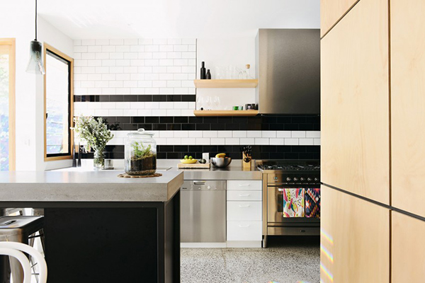 The kitchen also goes behind that pod. I like the black and white subway tiles used here!
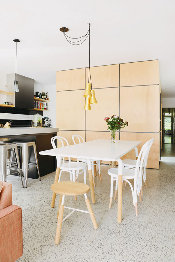 What caught my attention in this dining space is the design of the dining set and the golden lighting.
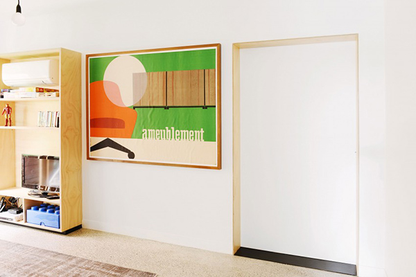 Look closely at this part of the house. That white door doesn’t open to a room.
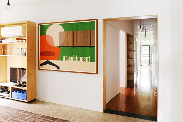 But it opens to a hallway that leads to other areas of the house and even to a door at the end.
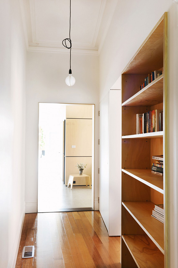 In this hallway, you can find a bookshelf that adds some life into it.
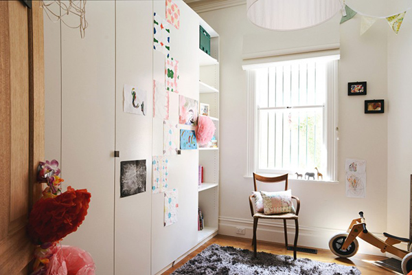 The kid’s room does look playful and fun with artworks and some paper flowers.
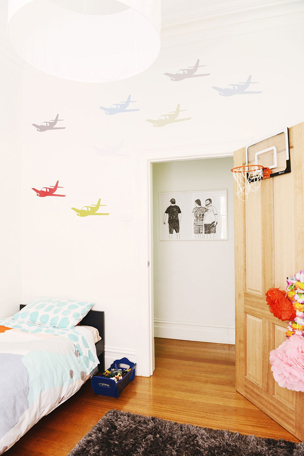 Airplane wall stickers are seen on another side of the wall. I guess the bedroom is used by a girl and a boy because there are flowers too.
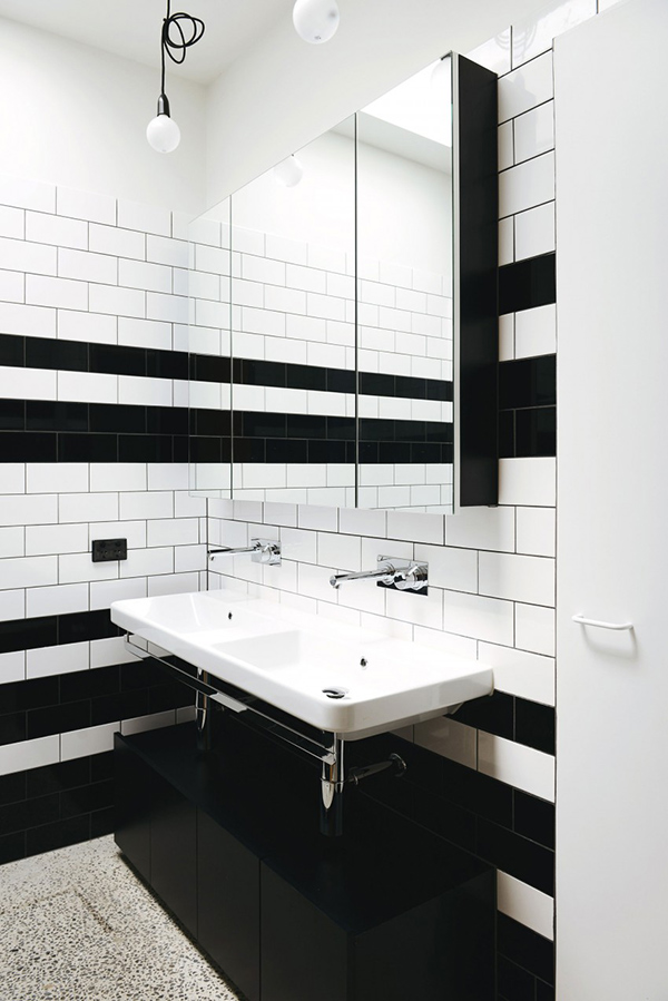 The look of the bathroom extends the black and white colors of the kitchen.
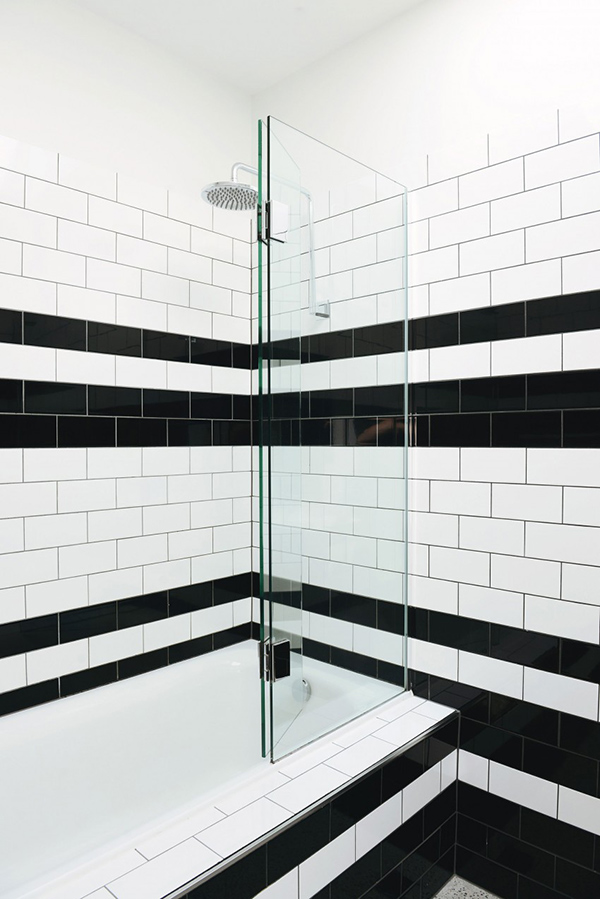 While this is the bathtub area with a glass door that can be folded.
I was intrigued about that cube in the center of the house from the first time I saw this. And I was right that it was housing some spaces that are functional for the home. Pretty amazing, right? This house design is done byNest Architects who made sure that the new part of the house will look lovely, function, bright and airy unlike the previous space that once stood in it. Can you tell me which parts of the house you love the most?


