Before and After: Neutral Colors and Playful Patterns Revamped Townhouse Interior
When you are busy with work, you might lack time to decorate and design your home. Sometimes, you will observe that your bedroom will be messy and unorganized because you are also in a rush every day. Well, this could be the experience of a designer who had a large cottage house but could no longer keep up with it because of her busy schedule. So, she decided to transfer to a smaller space.
The new place is 200 square feet smaller than the previous one but it had vaulted ceilings and vertical split-level open layout which made it appear larger. The owner, Rebecca Mitchell is a designer who works with bright colors and chaotic patterns every day. Because of that, she preferred to use black and white color scheme as well as simple patterns for the townhouse interior. She also remodeled the kitchen and gave it a modern style. Here are photos of the interior as well as a before and after photo of the kitchen area.
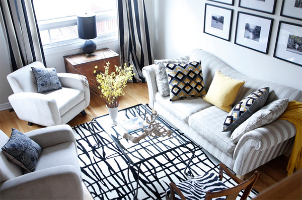 Beautiful patterns, right? The color is lovely too as it used some yellows with the black and white scheme. I like the area rug and throw pillows!
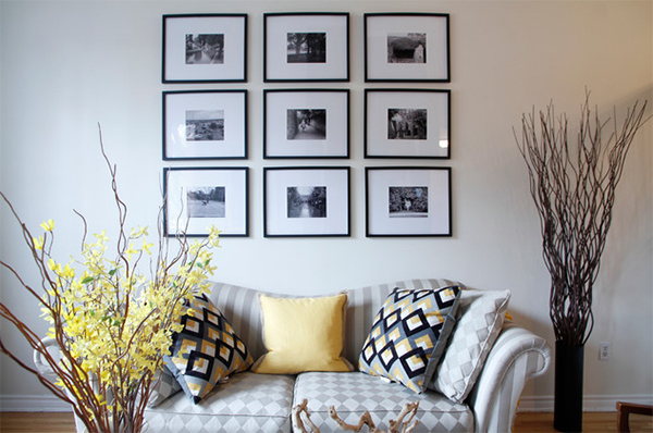 On the wall are framed photos from her family while they were still in England. Doing this will bring memories that she would like to see everyday.
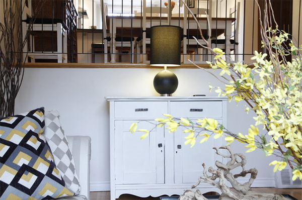 This pine chiffonier is revamped with white paint and a new hardware.
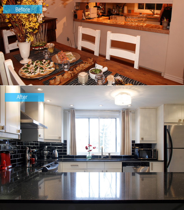 Mitchell removed the cupboard doors and backs of the old kitchen to create open shelving. She also remodeled the cabinetry too. She used 3/4-inh thick quartz for the countertop and splurged on glitzy hardware and high-end faucet.
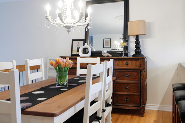 For the dining area, it has tables and chairs from Mad Dogs & Englishmen in England. On the buffet table, you can see a black lamp that she painted and some other meaningful decors.
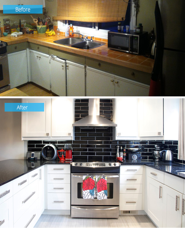 The original kitchen had olive walls and wood laminate flooring as well yellow ceramic counters. She changed the entire look for a bit of glamour.
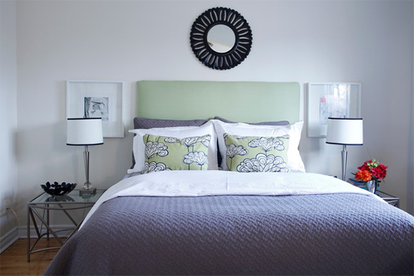 The headboard in this bedroom was made by Mitchell while the side tables were from a garage sale.
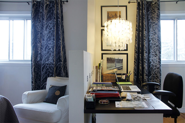 A bedroom was divided by a partition creating the other side into a home office.
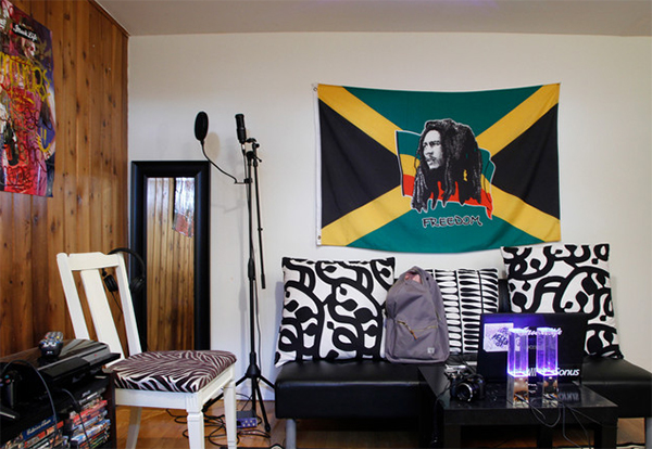 The basement was turned into a man cave. Mitchell originally planned to turn it into a family room but decided to let her son use it.
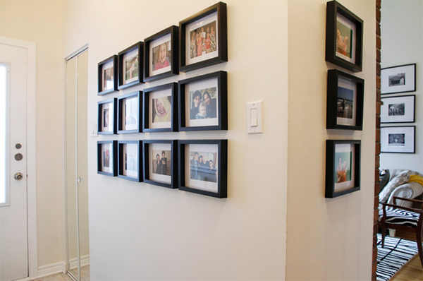 For a budget-friendly installation, they added framed photos of the family in the wall of the foyer.
So, how is that for a small family? Well it sure is enough! As a matter of fact, it looked even lovely despite the small space because of the neutral colors and patterns used in it. I love how the entire space was decorated. Owner and designer Rebecca Mitchell also made sure she won’t spend too much for their 1.400 square feet house with 3 bedrooms and 2 bathrooms. The house is occupied by Mitchell and her two children.


