Gorgeous Interior of Three-Level Contemporary San Francisco House
Some families prefer to have a one-storey house and just make it larger that is if they are blessed with a spacious lot. Still others who have a smaller lot area would increase the floor area by adding more levels. Commonly, homes would have one, two or three storeys, although there are dwellings that reach to more than three which is okay as long as their foundation is good and every level has a reasonable function. Of course, it is also okay if the family has enough budget to achieve that.
What we will feature today is a three level home in San Francisco, California that sits on a steep downhill lot. The designers attained the rare opportunity to design a new ground-up house in the area. They also took advantage of its vertical arrangement in order to achieve both intimacy and generosity. The three levels of the house observe a balance of both spatial luxuriousness and fluidity. In terms of materials, it used a disciplined and delicate approach in its usage and details. The design of the three levels showcases a multifunctional program that is perfect for a family of four. On the main level, it is divided into large open spaces where the living areas and kitchen are found. The areas are interwoven with discrete masses of a fireplace, powder room, and pantry. On the top floor, there is a switchback stair with a central landing that provides communal access to the bedrooms. The bedrooms in the house have a compact and efficient layout. As for the lower level, the materials used are distinct and it acts as private space or as an entertainment area. Let us take a look at the images of the house below.
Location: San Francisco, California
Designer: Studio Vara
Style: Contemporary
Number of Levels: Three-storey
Unique feature: A house with three levels featuring a beautiful interior in an open-layout using a distinct mix of materials.
Similar House: The Secret Behind the Extraordinary Three-Storey Sunny Side House in Singapore
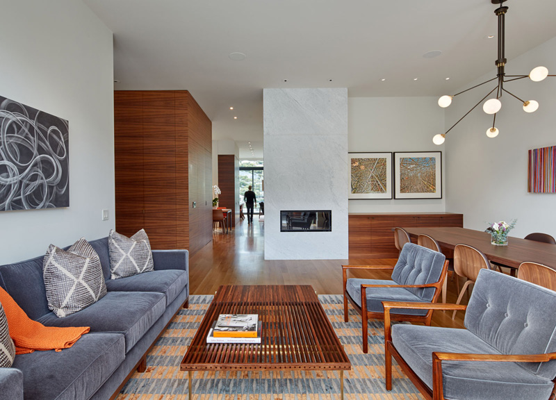 Isn’t this a beautiful and relaxing interior? Notice the good distribution of areas. Even if it is decorated with many items, it doesn’t look crowded because of good space planning.
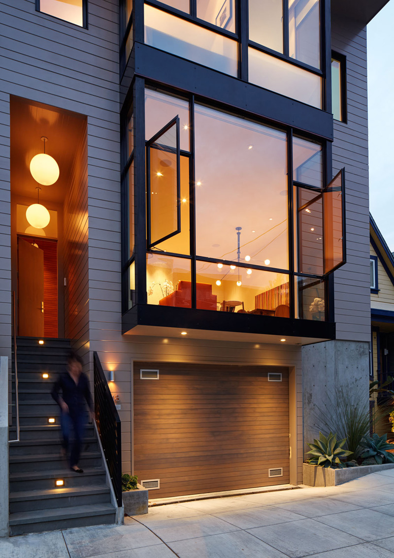 A glimpse at the exterior of the house with a contemporary modern design. A staircase is used to reach the entrance of the house. You can also see that it has a wooden garage door and that it features a garden-window design that is extended to the outside comprised of many glass to allow the entry of light and air into the house.
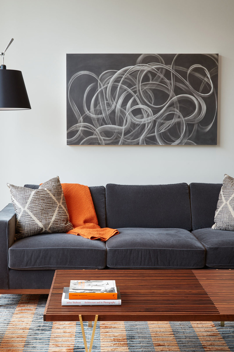 A comfy sofa is used for the living area with a smoky wall art in white and gray. You can see here a wooden center table that is a good match with the texture area rug as well as the color and design of the sofa.
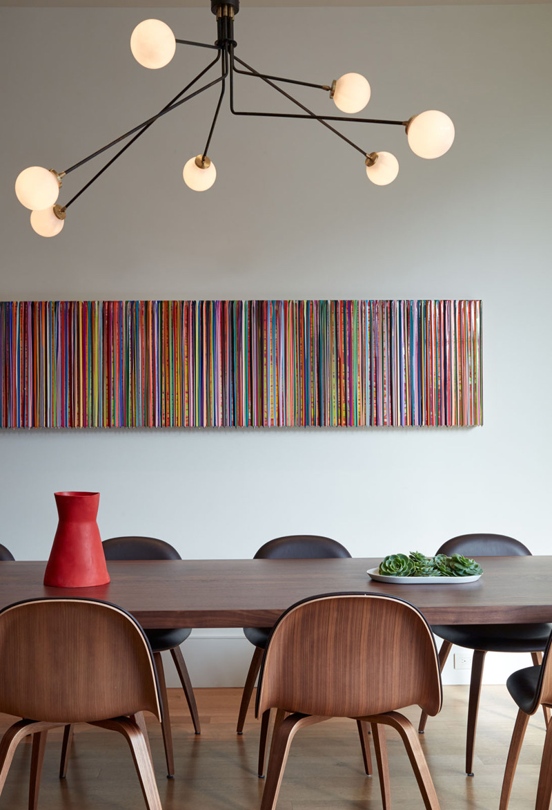 I like the neat and sleek look of the dining set here that is made of wood. Aside from that, the wall decor is also something I am digging which is a good idea for a lovely DIY!
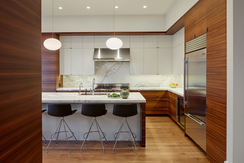 This is the kitchen area with a textured backsplash which looks nice with the white cabinets as well as the ones with a wooden texture. On the island, black modern high counter stools are used.
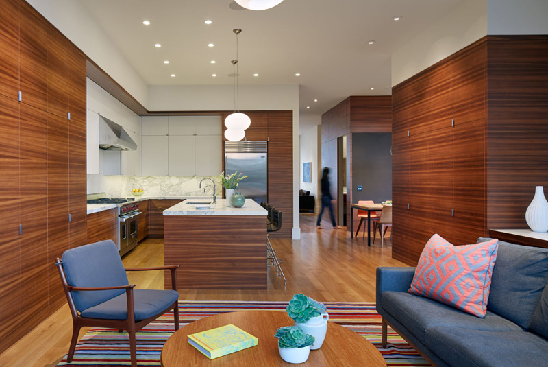 Seen here is the living area and the kitchen where you can get a glimpse of different cubes inside it that could be the pantry and other storage areas. The use of stripes for the area rug complements with the grain of the wood used in the interior.
Read Also: Casa Piscucha: A Modern Home With a Unique Wrapped Roof in El Salvador
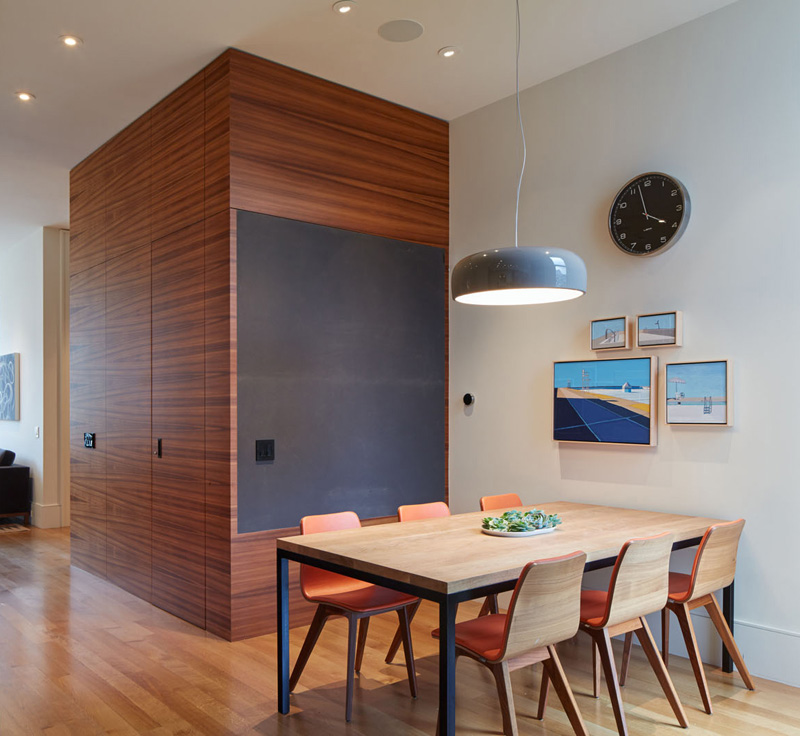 The dining room looks beautiful with the wall arts in blue colors as well as its choice of simple furniture design and pendant light. There is a cube here with an important function.
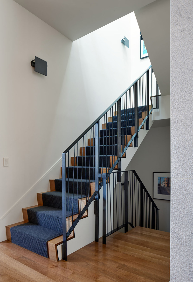 What connects the different levels of the house is this staircase with a mix of wood and steel. The stairs is covered with a carpet that adds to its beauty. For sure, it is also soft under the feet too.
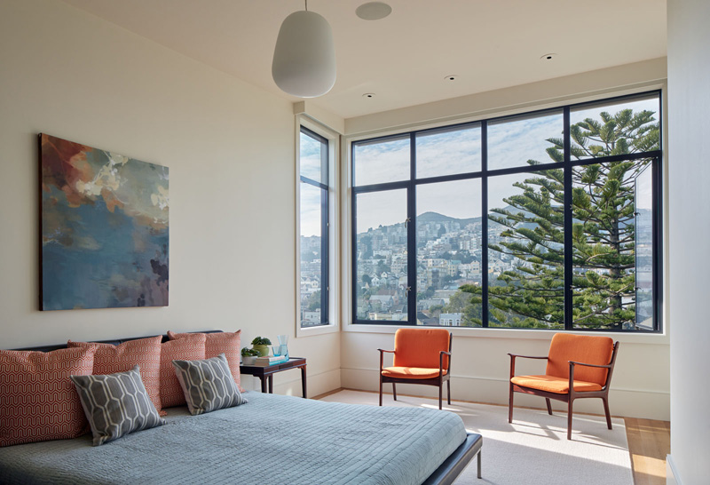 From the bedroom, one can see the lovely view of the city. You can see here that it used a mix of patterns for the cushions with orange chair as accents.
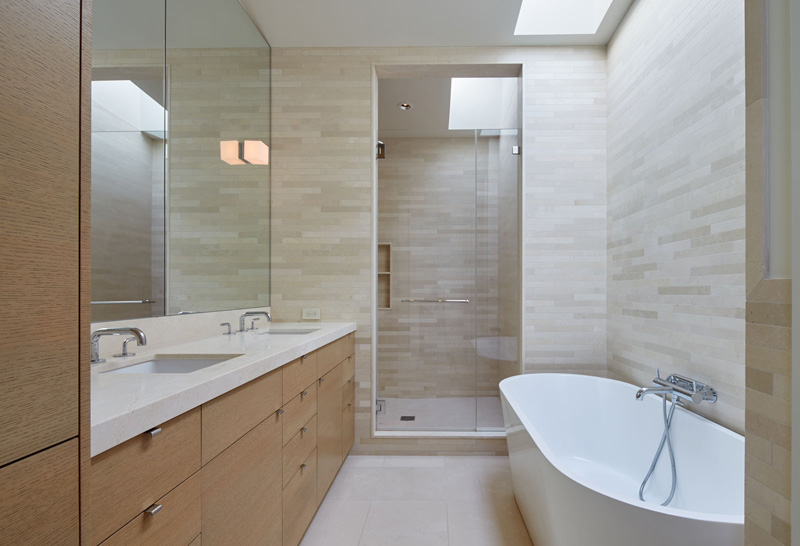 The bathroom has sandy colored wall tiles and a shower area that is enclosed in glass. It also used wood for the vanity too with a large mirror to bounce light all around the space.
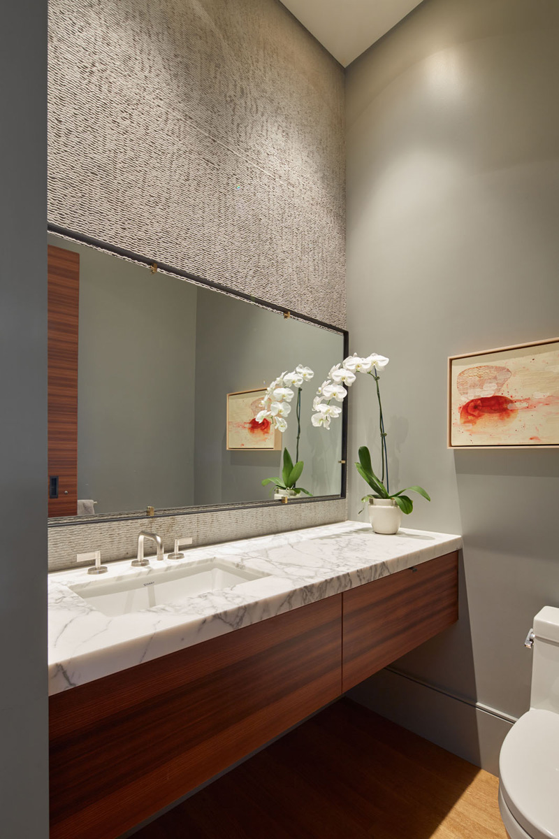 Another bathroom that used a mix of marble countertop and wooden cabinet for the vanity. What is attractive here is the wall where the mirror is installed as well as the wooden accent wall on the other side of the bathroom. It is a good idea to add plants in the bathroom for a refreshing feel.
One common feature in the house is its use of wood for the interior and the exterior. You can see that the design is very warm and relaxing resulting into a home that any dwellers would love to own. This house is designed by Studio Vara who was able to achieve a house design that fits the needs of the owners. It is also nice that each level has a different usage and function. Even its staircase design is nice too which seems to invite anyone to get into the different level of the house. So, what can you say about this home?


