A house doesn’t have to be spacious in order for it to be a home. There are really small homes but could still accommodate the comfort that one needs. Even apartments and condominiums can be a good place to dwell in if everything is well arranged and well planned. Today, we will show you a small house that has a good design utilizing the spaces in it.
It is a renovation of Roc Cube in the Gothic Quarter of Barcelona, Spain. The Nook Architects have done two other projects in the same building and they applied similar approach to what they did to the other projects especially that it was very similar in terms of dimensions, orientation and pre-set requirements. Daytime spaces were placed towards the street while the bedrooms where placed towards the inner courtyard. The location of the kitchen and bathroom were decided depending on the existing pipes of the house. Let us take a look at the Roc Cube below:
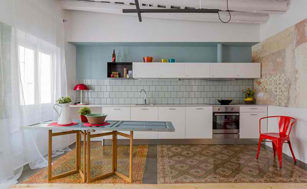
We noticed the patterns used in the interior which made it look interesting. The dining table can be kept and folded when not in use. Look closely at the time and you’ll find out that it is actually a door.
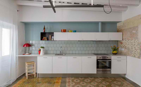
This kitchen maybe small but it can offer everything that the owner needs.
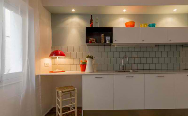
Lighting is important for small spaces to illuminate even a dark corner.
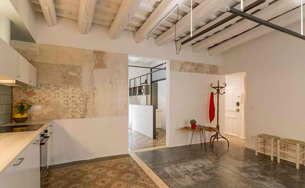
Note that this has a rustic and industrial look intertwining it with modern design.
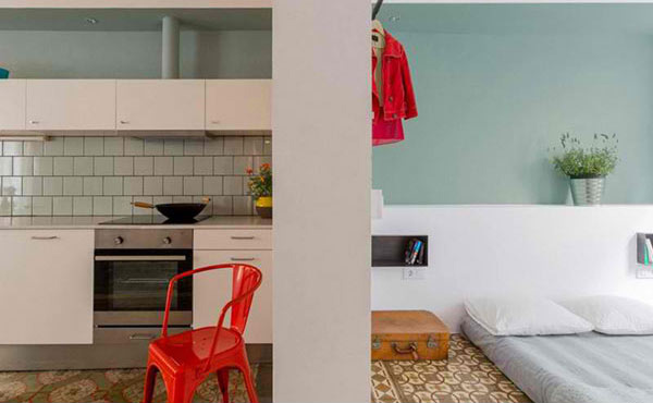
Just next to the kitchen is a bedroom.
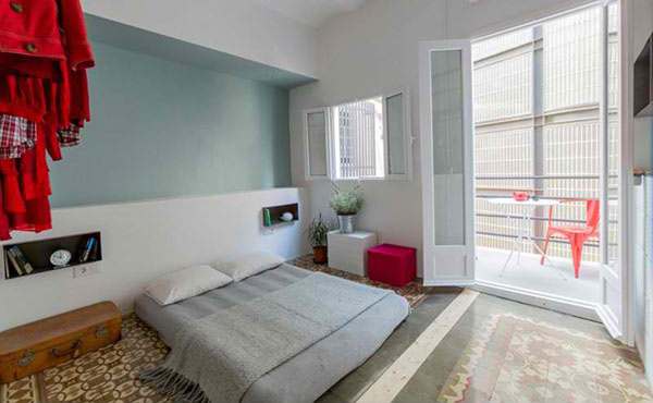
And we are referring to this bedroom! Small but is one resting place that provides a good spot for relaxation especially with the colors in it.
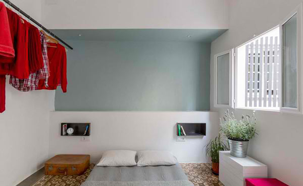
You can see that a rod was used to hang clothes instead of installing a cabinet.
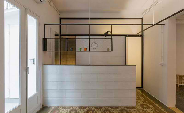
This leads to the bathroom and toilet which can be accessed from two different doors.
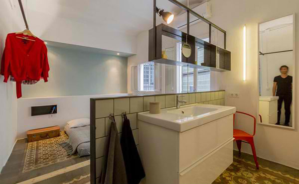
The powder room is behind that wall partition we saw in the previous image.
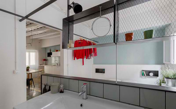
It has these industrial looking shelves just above it to store some personal items and even displays.
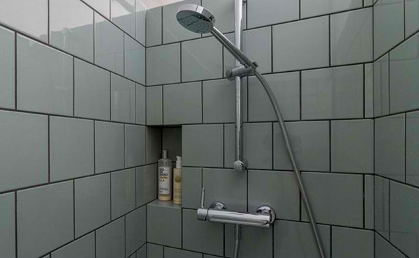
Adding an inset shelf for the shower area is one good way to save space.
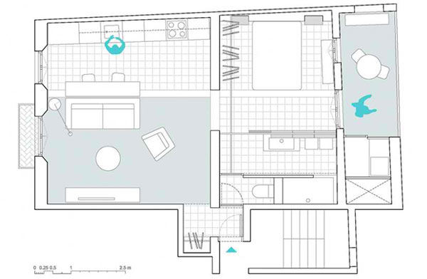
This is the floor plan of the house showing us how small the space really is.
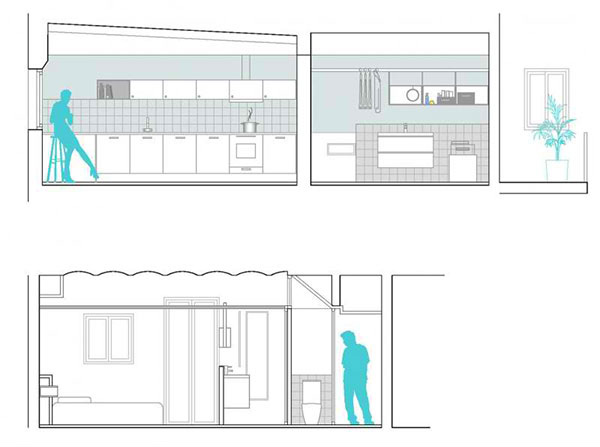
While this will give us a better idea of how the looks like through a cross-section drawing.
The Nook Architects has something to say about the project: “The building’s structure and closings are very irregular, so we introduced lineal elements that counterpoint these irregularities and set order within the space. Amongst these elements are a close hanger that integrates lighting (borrowed from Twin House) and connects itself with the support of the suspended cubes and the sliding door’s guide. Wood was used to set limits on the pavement which regulates the traces of the previously existing partition walls.” Well, this is one simple home but we know that it is perfect for whoever is dwelling in it and the design is really nice!