How to Mix Patterns Rightly in Your Interior
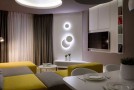
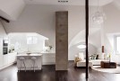
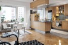
We all love to see patterns in our home interiors. We can see that from the bedroom’s bed covers to the living room’s curtains and even to the bathroom’s wallpaper. Seeing patterns in the house is expected because it is one element in design that brings some graphical element to any space. As a matter of fact, even your furniture may have pattern prints too as well as other decors just like an area rug.
But some people are afraid to play with patterns thinking that they might get it wrongly and end up with a busy crowded looking space. In truth, when used rightly, patterns can enhance the appeal of your interiors but when used wrongly, you might end up with a space that is an eye sore which fails the purpose of creating a cozy home. So, today, we are going to give you some tips on how you can mix patterns the right way.
1. Decide on a color scheme.
First and foremost, you have to know what colors you are going to use for your interior. Choose colors that would look great together. This is a good start for choosing the colors of your patterns too. For instance you decided on black and white with some pops of red, then get a pattern with these colors. Doing this will create a coherent look in your interior.
2. Begin with a print you love.
You can also pick a pattern that you love most. Some people know what patterns they would like to use while others aren’t certain. Patterns had a wide variety of choices from stripes, chevron, damask, polka dot and a lot more. One good rule of thumb in choosing the patter is to include some solid color in each pattern so you will not overwhelm the room. Also, when you have picked a fave pattern, don’t go too small or it would looked washed-out from afar. You also have to use various scales of the same pattern so it will look wonderful.
3. Play safe with neutral colors.
If you think adding colorful patterns into your space will just make it look very busy, then pick patterns in neutral colors. You can get those with shades like off-white, cream or beige. These could either be the base color of your pattern or the colors of the entire pattern as well. For sure a pattern like this will fit in whatever is your color scheme.
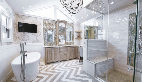
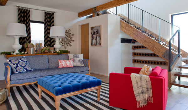
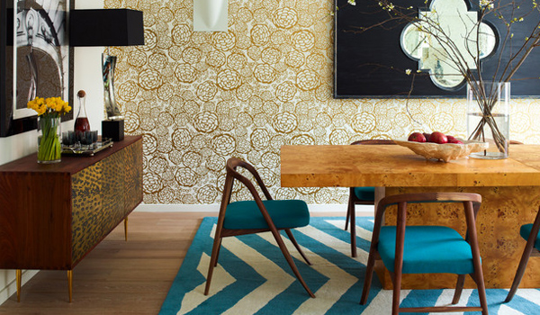
4. Consider size of patterns.
Rikki Snyder
It is essential to look into the sizes of the patterns that you combine together. Avoid using the same sizes or scale of patterns together or next to each other. For example, you can use a larger pattern for your curtains and smaller ones for your throw pillows. Scale and size of the patterns will help create harmony in your space. If you use large patterns all throughout, it would look very overwhelming!
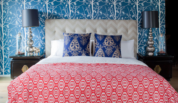
5. Combine white and a colored pattern.
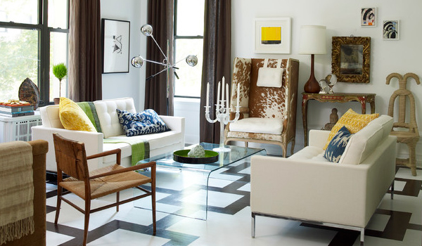
Another safe way to use patterns is to combine it with white or simply pick a pattern with white background. Some would even stick with black and white patterns which can also be a good idea. You can try combining different colors of patterns with white base. Just see to it that they are not overabundance to see.
6. Combine bold colors with patterns.
Whatever is the pattern design, no matter how busy it looks, it would look lovely with bold colors. You can choose from red to aquamarine blue and others. You can do this by pairing a patterned throw pillows with some pillows with bold plain colors. Or if you have a patterned furniture, add some charm with a bold color throw pillow.
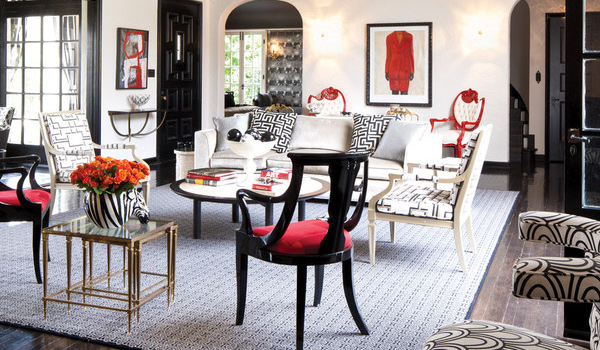
7. The number of patterns to mix together.
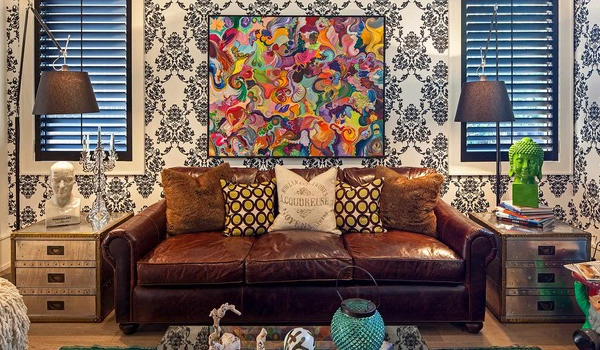
Peter A. Sellar – Architectural Photographer
So, how many patterns can you use together in one space? Designers suggest using three to four patterns in various scales and sizes. There would be a large scale pattern which is the most influential in the room. In most cases, it is the wallpaper because it occupies a large space. With that, pick additional patterns that are half the size in different designs. You can then pick other pattern designs from that.
8. Use patterns in one color but varying tones.
It is a common thing to do a tone on tone color for the patterns. This means that you use various saturations and tint levels of a single color. Doing this will make mixing and matching a lot easier. Don’t forget scaling again when you opt to use this style. You can choose one pattern with a large impact and then add smaller or tighter dynamic prints.
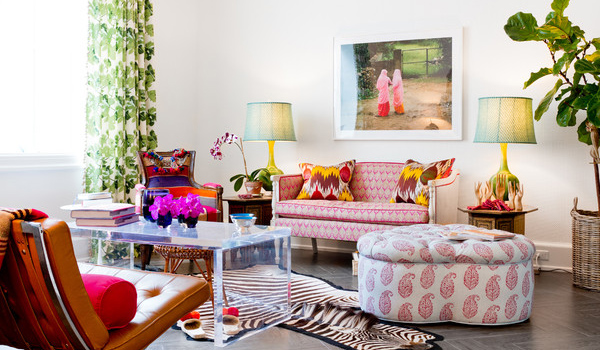
9. Use different patterns of the same color.
For me, this one never fails. You have chosen your color scheme for the room, then it is time to get the patterns. Unsure of what to pick? Go get your favorite pattern prints but with the same color. For example, use red chevron patterns with red striped patterns and so on. This will surely work well.
10. Get some inspiration.
If you are still uncertain of what to do with your patterns, then go ahead and get some inspiration from existing designs. There are so many interior spaces online and in magazines that you can check. You can get ideas of what patterns you can use together through them. At least, you have already seen how they would look like together.
Patterns are indeed beautiful! Once you decide to use this design element for your home, you can go back to the tips we have given you above. We hope these came in handy for you and that it could help you in decorating your home spaces. Patterns can make or break the look of your interiors. Hence, make sure that you use them in a way that it will upgrade the appearance of your home.