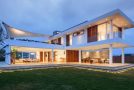
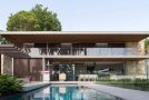
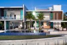
Modern Minimalist Interior of J House
In Taipei, Taiwan, a modern private residence known as the J House sits on its premises. Said house has tones of gray and white to make it look minimal in design. Once you see the images of the house, you will really think that it adapted a modern minimalist approach in house design. Nevertheless, it looked spectacular despite lesser decorations in the interior.
The intelligent minds behind the J House are KCD Design. In truth, it can sometimes be challenging to design a minimalist interior especially that there are so many gorgeous stuffs in the market that would fit into a home. But the designers don’t just consider their design preference but that of the homeowners. That is why, the interior of the house was based on the client’s needs and taste. Let us take a look at the interior of J House below:
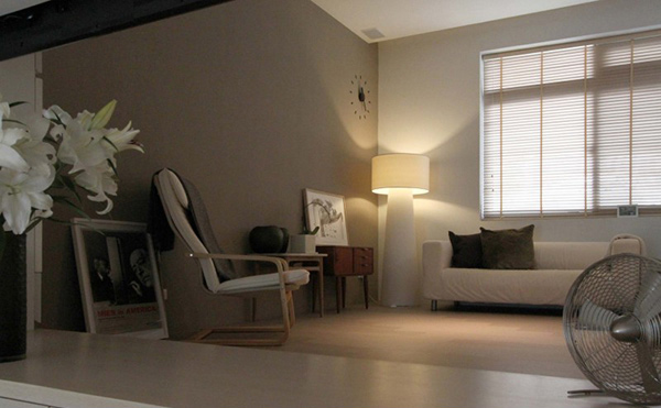
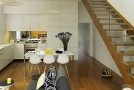
A simple living area decorated with some picture frames in black and white print. It used blinds for the window to control the amount of light to get inside.
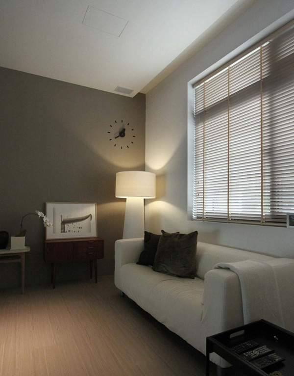
Note that wall clock! Isn’t it unique? That simple floor lamp is a perfect lighting to this space.
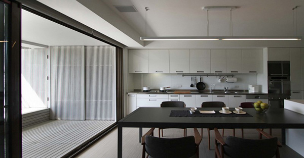
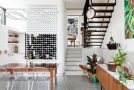
The kitchen in white and the dining set in black- great contrast right?
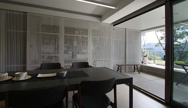
Closer look at the black dining set in this area that has glass walls around it. Note the vertical wood on the background, what do you think it could be?
With a white interior, the dining set was emphasized even more!
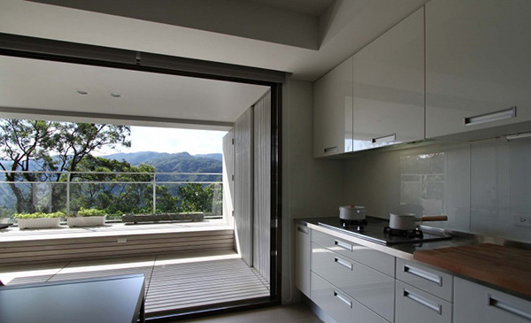
The kitchen has white modular cabinets with ample storage spaces to keep this place free from clutter.
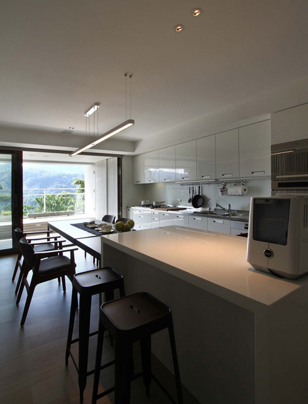
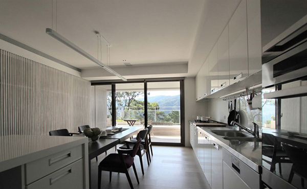
Another look at the dining and kitchen area where you can also see an island.
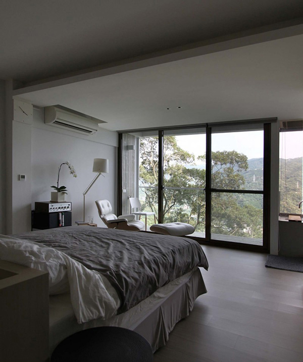
The bedroom could allow the homeowners to get a stunning view of the mountains though the glass walls, windows and doors. But don’t worry, the blinds can always be opened to shade the bedroom.
A comfortable recliner waits near the door that leads to the terrace.
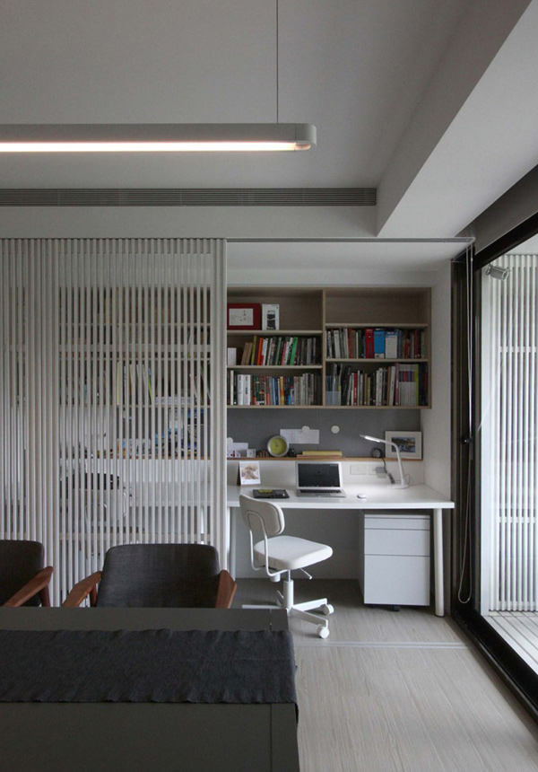
Surprisingly, a home office is revealed behind the dining area which was hidden by the vertical partition.
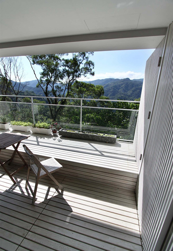
The terrace has a wooden set of chairs and a table. The glass railings looked totally modern yet stylish!
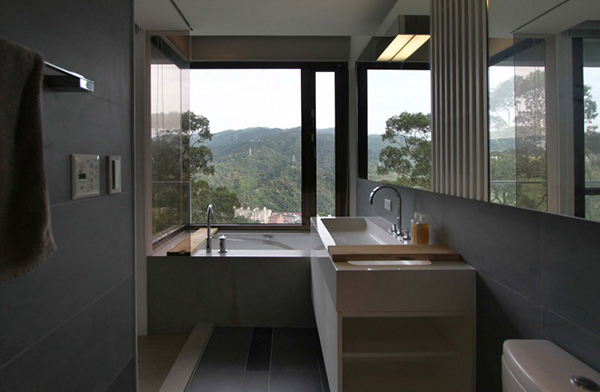
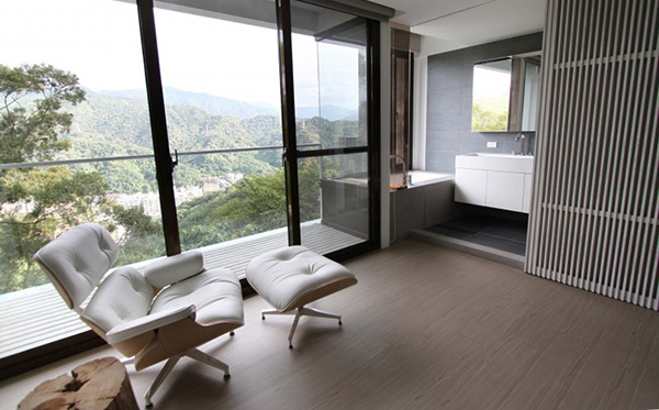
The bathroom has gray tones as it used ceramic tiles for the walls and flooring.
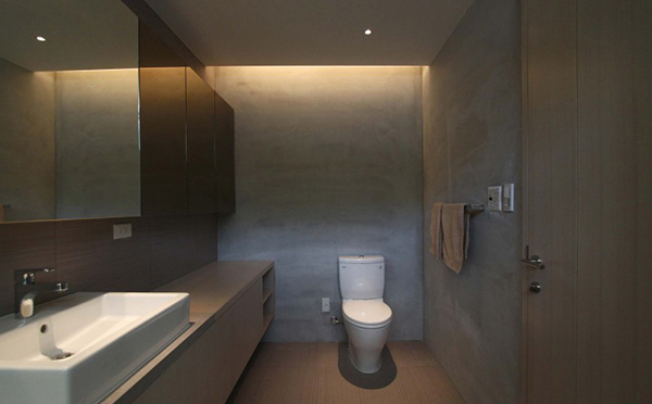
We’d guess this is a another bathroom since the walls looked unfinished yet neat.
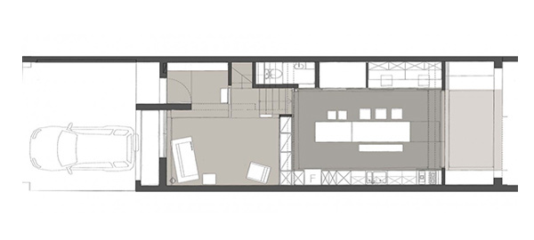
Seen here is the ground floor plan of the house showing us the dining area, garage and living area.
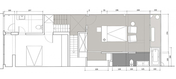
On the second floor of the house are the bedroom and bathrooms.
Now that you have seen the interior, we are sure that you agreed with us that is used a simple design but still it looked pretty well. It really depends on how the spaces are distributed and how it is designed so that it will not look boring. The interior used gray and white colors on most areas but with the furniture and accents in it, it did not look boring. The KCD Design sure did good for this project!